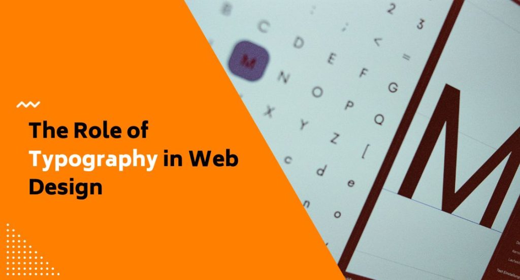
We get a lot of calls from business owners who think their website just needs a refresh, and once we start digging, we almost always find the same thing: nobody paid attention to typography. It’s easy to overlook because it doesn’t feel like a design decision the way a logo or colour palette does. At FirstPage Marketing, we’ve come to see the role of typography in web design as one of the most underrated levers a business has for building trust, improving readability, guiding people toward what they actually came for, and getting more visitors to take action.
Typography Is a Functional Decision, Not Just an Aesthetic One
Most people assume typography is about picking a font that looks nice. We wish it were that simple. Type choice affects how quickly someone can scan your page, how long they stick around, whether they trust what they’re reading, and whether they walk away with the right impression of your business.
Here’s the part that surprises a lot of our clients: most visitors don’t read a webpage word for word. They skim. Ever landed on a site and felt an urge to leave before you even knew why? There’s a decent chance typography was the culprit. If your headings are too small, your line spacing is cramped, or your body copy sits at a low contrast against the background, you’re asking people to work harder than they should for information they came to find quickly. That friction adds up, and it shows up in your bounce rate whether you’re tracking it or not.
We’ve also seen firsthand how type adjustments can move the needle on conversions. Something as simple as increasing line height or swapping a decorative display font for a cleaner reading face can change how long someone stays on a page and whether they click through to your contact form. It’s not magic; it’s just removing obstacles between your reader and your message.
Learn how to rebrand your business without losing existing customers.
Building a Type System, Not Just Choosing a Font
One mistake we see constantly is a business picking a single “pretty” font and using it everywhere: headings, body text, buttons, captions, all identical. That’s not a type system. A proper type system establishes a clear hierarchy so readers always know what they’re looking at.
When we build out typography for a client site, we’re thinking through:
- A heading typeface with enough personality to carry your brand, used sparingly and at sizes that create obvious hierarchy between H1, H2, and H3
- A body typeface chosen purely for legibility at small sizes, since this is what carries the bulk of your reading content
- A defined type scale, meaning each heading level steps up in size by a consistent ratio rather than random guessing
- Fluid, responsive sizing so your type doesn’t shrink into illegibility on a phone or balloon awkwardly on a widescreen monitor
Font Pairing Doesn’t Have to Be Complicated
We keep pairing simple: one typeface for headings, one for body copy, and occasionally a third accent face reserved for small details like labels or pull quotes. We know, we know, that’s not exactly a wild design secret. But the goal isn’t variety for its own sake. It’s contrast, plain and simple, so your readers can instantly tell the difference between a heading and a paragraph without having to think about it.
Accessibility Isn’t Optional Anymore
We’d be doing you a disservice if we didn’t bring up accessibility here, because it’s become one of the biggest reasons Canadian businesses reach out to us about their typography in the first place. Under the Accessibility for Ontarians with Disabilities Act, larger organizations and public sector bodies need to meet recognized web accessibility guidelines around typography, and we treat that same benchmark as the standard for every Canadian client we work with, wherever they happen to be based.
What that means in plain terms is that your type choices need to hold up for real people, including those with low vision or reading disabilities. We look at:
- Contrast between text and background colour
- Whether text can be resized without breaking your layout
- Avoiding images of text that can’t be read by screen readers or zoomed by the user
- Choosing letterforms that stay distinguishable at small sizes rather than fonts where similar characters blur together
Getting this right protects you from potential legal exposure, sure, but honestly, it’s also just good business. A site that’s easier to read is easier to read for everyone, not only the visitors accessibility standards are designed to protect.
Learn how to properly optimize e-commerce product pages.
The Font Licensing Trap Nobody Warns You About
This one catches almost everyone off guard, including businesses who’ve worked with other agencies before. A font licensed for use on your desktop computer, in something like a logo file or a print brochure, is not automatically licensed for use on a live website. Web deployment usually requires a separate web font licence, and using a font without one creates real legal exposure for your business.
We’ve inherited more than one project where a previous agency built a beautiful brand around a font the client never actually held a web licence for. It’s an uncomfortable conversation to have after launch, so we’d rather have it before. If you’re working with any agency on your site, ask directly who holds the font licences and whether they transfer to you once the project wraps.
Trends Worth Knowing, Without Chasing Every One
Type design keeps evolving, and we watch a handful of threads pull in different directions at once. Variable font files, for instance, now pack multiple weights and widths into a single lightweight download, and we like that it helps page speed as much as design flexibility. We’re also seeing bold, oversized display type show up on more of the homepages we look at, with brands leaning on typography itself as the main visual statement. Oddly enough, a real countertrend is brewing right alongside that: designers deliberately choosing slightly imperfect, hand-crafted lettering to stand out from generic, machine-polished visuals. On the more technical side, we’re also watching kinetic type creep in, letterforms that move or react as someone scrolls, working its way into homepage hero sections.
We keep an eye on all of it, but we don’t chase every trend for every client. Your typography should serve your brand and your reader first. If a trend fits both, we’ll bring it up. If it’s just noise, we’ll tell you that too.
Let’s Talk Typography
Typography touches nearly everything on your website, from how quickly someone finds what they need to whether your brand feels credible the moment a page loads. Getting your type system right means faster reading, better accessibility, fewer visitors bouncing before they get your message, and a site that actually reflects the business behind it. If your current site feels harder to read than it should, or you’re not sure whether your fonts are even properly licensed, we’re happy to take a look. Reach out to our team at 604-866-2230 and we’ll walk you through what your typography could be doing for you.